Freedom Tower Redux

N&P: Discussion of news headlines and politics.

Moderator: frigidmagi

Post Reply
Ra
Master
Posts: 1643
Joined: Thu Jun 09, 2005 11:36 am
19
Location: Back?
Contact:

#1 Freedom Tower Redux

Post by Ra »

CNN wrote:New WTC tower design made public

From Phil Hirschkorn
CNN New York

Wednesday, June 29, 2005; Posted: 11:41 a.m. EDT (15:41 GMT)

NEW YORK (CNN) -- New York officials released the latest design for the signature building at the World Trade Center site Wednesday after revising it to make the tower more secure.

Gov. George Pataki ordered the design changes because police were concerned that the tower's placement adjacent to West Street, a major thoroughfare along the west side of Manhattan, would make it vulnerable to a truck bomb.

Instead of being 25 feet from West Street, the tower will be set back 90 feet, and its 200-foot base will be covered in steel and titanium intended to make it blast-resistant.

"This new design reflects a soaring tribute to freedom and a bedrock commitment to safety and security," Pataki said.

The building, which has been dubbed "The Freedom Tower" by Pataki, will remain 1,776 feet, symbolizing the year the United States declared its independence.

It would be almost 100 feet taller than the Taipei 101 Tower in Taiwan, currently the tallest building in the world.

It also will retain a spire, containing a 400-foot broadcast antenna which will emit light at night and is intended to echo the Statue of Liberty's torch.

The tower will be more slender and occupy a smaller footprint in the northwest corner of the 16 acres where the 110-story twin towers once stood, and it won't be completed until 2010, two years later than the original plan.

Pataki and New York City Mayor Mike Bloomberg will be joined by WTC developer Larry Silverstein and architect David Childs in presenting the new model at a 10 a.m. ET news conference on Wall Street.

The tower was originally conceived by architect Daniel Libeskind, whose master site plan was chosen in February 2003 to guide the rebuilding process.

Libeskind later was forced to collaborate with Childs, hired by Silverstein, to refine the design, which was unveiled in December 2003.

The 2003 Freedom Tower model featured a torqued glass-and-steel design with a steel cable netting. It had 2.6 million square feet of commercial space, including more than 60 floors for offices, an indoor observation deck above, a sky restaurant and wind-harvesting turbines to supply some of the building's power.

The revised tower design has the same amount of commercial space, one-quarter of what was lost on September 11, 2001, and many of the same features.

The public observation deck will be at 1,362 feet, the height of old South Tower, while a glass wall will rise 1,368 feet, the height of the old North Tower.

A cornerstone was laid July 4, 2004.

No tenants, other than the governor and the Port Authority of New York and New Jersey, the transportation agency that owns the site land, have expressed interest in moving offices into the tower.

Childs said the tower is "bold and simple" and would be a "marker in the sky for the memorial below."

Groundbreaking for the September 11 memorial will take place early next year, with construction scheduled to be finished in September 2009.

The memorial, Reflecting Absence, featuring two reflecting pools where the towers stood, will occupy 4.5 acres and will be the first project completed on the site.

CNN's Jonathan Wald contributed to this report.
Linkage.

Judging by the pictures, the revised design actually looks quite nice. It certainly looks better than that glass eyesore from before. Unfortunately, it still has a marked lack of office space, compared to the old WTC.
- Ra
Jonathan McKenzie
Half-Insane Snakehead | MSPaint Acolyte | Wierd TGOD'er


"Every time you stay abstinent...Kitten kills a god."
User avatar
frigidmagi
Dragon Death-Marine General
Posts: 14757
Joined: Wed Jun 08, 2005 11:03 am
19
Location: Alone and unafraid

#2

Post by frigidmagi »

It does look nice, but I liked the idea of slamming a huge middle finger on top of the rebuilt towers... Or didn't anyone see that stand up routine?
"it takes two sides to end a war but only one to start one. And those who do not have swords may still die upon them." Tolken
Ra
Master
Posts: 1643
Joined: Thu Jun 09, 2005 11:36 am
19
Location: Back?
Contact:

#3

Post by Ra »

I saw that too. I thought that was how it should have always been. :D
- Ra
Jonathan McKenzie
Half-Insane Snakehead | MSPaint Acolyte | Wierd TGOD'er


"Every time you stay abstinent...Kitten kills a god."
User avatar
Cpl Kendall
Disciple
Posts: 856
Joined: Mon Jun 13, 2005 2:16 pm
19
Location: Ontario, Canada

#4

Post by Cpl Kendall »

frigidmagi wrote:It does look nice, but I liked the idea of slamming a huge middle finger on top of the rebuilt towers... Or didn't anyone see that stand up routine?
I never saw the routine, but I like the idea.
Kreshna Aryaguna Nurzaman
Sick, Twisted Fuck
Posts: 1949
Joined: Thu Jun 09, 2005 2:37 pm
19
Location: MENTAL HOSPITAL
Contact:

#5

Post by Kreshna Aryaguna Nurzaman »

Dunno', I still prefer the old twin-tower design. This new one looks too... "conservative", y'know. (and no, the unorthodox angles don't help it either)
The Sick, Twisted Fuck | Sap #2 of the Bitter Trio | Knight of the e-mail | Evil Liberal Conspirator | Esoteric Order of Dagon | Weird TGODer

Share your free D&D character here.

:welcome :arrow: :sheepfucker: :thumbsup

So be it. If saying "NO" means being alone, then to hell with love, with romance, with marriage, and all the shit life keeps pumping at me. I'll walk alone, but with freedom and a healed pride.

NEVER buy a LiteOn CD/DVD Writer. Ever.
Ra
Master
Posts: 1643
Joined: Thu Jun 09, 2005 11:36 am
19
Location: Back?
Contact:

#6

Post by Ra »

Of course, I preferred the old design myself. The Donald recently offered to rebuild the towers in an upgraded (structural improvements and the addition of one more story) form, but the commission rejected it out of hand.

Still, I personally think this is a nice design, but I will agree that it's a little on the conservative side. However, one thing is for sure; they will never make a design that everyone is happy with. Hell, even the original WTC had people who adored the design (myself included), and some who thought it was an eyesore that didn't "conform" to the NYC skyline. They believed that it was too modern looking, and crap of that nature.

My point, they need to get off their asses and build the thing before it becomes a real-life Tower of Babel.
- Ra
Jonathan McKenzie
Half-Insane Snakehead | MSPaint Acolyte | Wierd TGOD'er


"Every time you stay abstinent...Kitten kills a god."
Kreshna Aryaguna Nurzaman
Sick, Twisted Fuck
Posts: 1949
Joined: Thu Jun 09, 2005 2:37 pm
19
Location: MENTAL HOSPITAL
Contact:

#7

Post by Kreshna Aryaguna Nurzaman »

Ra wrote:Hell, even the original WTC had people who adored the design (myself included), and some who thought it was an eyesore that didn't "conform" to the NYC skyline. They believed that it was too modern looking, and crap of that nature.
Wait, they said the original WTC is too modern? :shock:


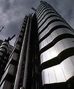
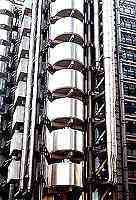
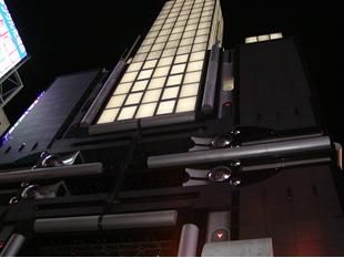
Well, when it goes to building architecture, my taste always goes to post-modern, futuristic design like these:

Image

Image

Image

Image

Image

Image
The Sick, Twisted Fuck | Sap #2 of the Bitter Trio | Knight of the e-mail | Evil Liberal Conspirator | Esoteric Order of Dagon | Weird TGODer

Share your free D&D character here.

:welcome :arrow: :sheepfucker: :thumbsup

So be it. If saying "NO" means being alone, then to hell with love, with romance, with marriage, and all the shit life keeps pumping at me. I'll walk alone, but with freedom and a healed pride.

NEVER buy a LiteOn CD/DVD Writer. Ever.
Ra
Master
Posts: 1643
Joined: Thu Jun 09, 2005 11:36 am
19
Location: Back?
Contact:

#8

Post by Ra »

Yes, I like postmodern archetecture myself. Anyway, I recalled some people bitching about how the WTC didn't conform to the Art Deco and Gothic styles, and that the new design should "reflect" that. :roll:
- Ra
Jonathan McKenzie
Half-Insane Snakehead | MSPaint Acolyte | Wierd TGOD'er


"Every time you stay abstinent...Kitten kills a god."
Kreshna Aryaguna Nurzaman
Sick, Twisted Fuck
Posts: 1949
Joined: Thu Jun 09, 2005 2:37 pm
19
Location: MENTAL HOSPITAL
Contact:

#9

Post by Kreshna Aryaguna Nurzaman »

Ra wrote:Yes, I like postmodern archetecture myself. Anyway, I recalled some people bitching about how the WTC didn't conform to the Art Deco and Gothic styles, and that the new design should "reflect" that. :roll:
- Ra
Gah, I always hate Gothic. Looks like... Gotham City, y'know. *shudders*

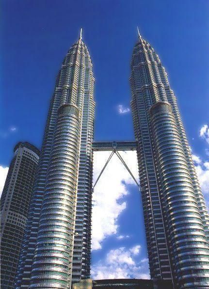
What do you think about Petronas Tower, by the way?

Image
The Sick, Twisted Fuck | Sap #2 of the Bitter Trio | Knight of the e-mail | Evil Liberal Conspirator | Esoteric Order of Dagon | Weird TGODer

Share your free D&D character here.

:welcome :arrow: :sheepfucker: :thumbsup

So be it. If saying "NO" means being alone, then to hell with love, with romance, with marriage, and all the shit life keeps pumping at me. I'll walk alone, but with freedom and a healed pride.

NEVER buy a LiteOn CD/DVD Writer. Ever.
Ra
Master
Posts: 1643
Joined: Thu Jun 09, 2005 11:36 am
19
Location: Back?
Contact:

#10

Post by Ra »

KAN wrote:Gah, I always hate Gothic. Looks like... Gotham City, y'know. *shudders*
Yeah. I personally hate Art Deco, too. The Empire State Building looks nice, but some of that other Art Deco stuff around is just *bleh*.
What do you think about Petronas Tower, by the way?

<snip pic>
I always loved the Petronas Towers. That's what modern archetecture should look like; inspired, but not overly flashy.
- Ra
Jonathan McKenzie
Half-Insane Snakehead | MSPaint Acolyte | Wierd TGOD'er


"Every time you stay abstinent...Kitten kills a god."
Kreshna Aryaguna Nurzaman
Sick, Twisted Fuck
Posts: 1949
Joined: Thu Jun 09, 2005 2:37 pm
19
Location: MENTAL HOSPITAL
Contact:

#11

Post by Kreshna Aryaguna Nurzaman »

Ra wrote:I always loved the Petronas Towers. That's what modern archetecture should look like; inspired, but not overly flashy.
- Ra
The overal shape gives an impression of an oil rig, but no wonder; Petronas is an oil company.

Now the lower part of the building does look futuristic, but the upper part (from the tapering and up) looks... well, I don't know. "Colonial"?
The Sick, Twisted Fuck | Sap #2 of the Bitter Trio | Knight of the e-mail | Evil Liberal Conspirator | Esoteric Order of Dagon | Weird TGODer

Share your free D&D character here.

:welcome :arrow: :sheepfucker: :thumbsup

So be it. If saying "NO" means being alone, then to hell with love, with romance, with marriage, and all the shit life keeps pumping at me. I'll walk alone, but with freedom and a healed pride.

NEVER buy a LiteOn CD/DVD Writer. Ever.
Ra
Master
Posts: 1643
Joined: Thu Jun 09, 2005 11:36 am
19
Location: Back?
Contact:

#12

Post by Ra »

The overal shape gives an impression of an oil rig, but no wonder; Petronas is an oil company.
Well, by "inspired" I was refering to how the cross-section is that of an Islamic star, but you have a point there. :P
Now the lower part of the building does look futuristic, but the upper part (from the tapering and up) looks... well, I don't know. "Colonial"?
I would suppose, but the tapering just seemed like a stability feature to me. Then again, it could draw from the design of some older European buildings, like, a cathedral tower, perhaps.
- Ra
Jonathan McKenzie
Half-Insane Snakehead | MSPaint Acolyte | Wierd TGOD'er


"Every time you stay abstinent...Kitten kills a god."
Post Reply