Current Project: RPG Toolkit, codename "M3"
- Ace Pace
- Antisemetical Semite
- Posts: 2272
- Joined: Wed Jun 08, 2005 10:28 am
- 19
- Location: Cuddling with stress pills
- Contact:
#201
Discussion on characters. Before me and Adam can write up a format and editors for characters, we need to agree on what characters can contain.
What follows is a short list of possible list of features for characters, by no means exhaustive.
1)Name.
2)Unique ID.
3)Portraits.
4)Animations for global map.
5)Animations for battle map.
6)An extendable list of statistics, such as health, easily added to.
7)A container listing what items the character has.
8)A container listing what spells the character has(this might be changed depending on system).
9)Possibly, depending on engine coding, a container listing intereactions with other characters?
[img=left]http://www.libriumarcana.com/Uploads/Ace/acewip7.jpg[/img]Grand Dolphin Conspiracy
The twin cub, the Cyborg dolphin wolf.
Dorsk 81: this is why I support the separation of Aces eyebrow's, something that ugly should never be joined
Mayabird:You see what this place does to us? It's like how Eskimos have their 16 names for snow. We have to precisely define what shafting we're receiving.
"Do we think Israel would be nuts enough to go back into Lebanon with Olmert still in power and calling the shots? They could hook Sharon up to a heart monitor and interpret the blips and bleeps as "yes" and "no" and do better than that, both strategically and emotionally."
- Destructionator XV
- Lead Programmer
- Posts: 2352
- Joined: Sun Jun 12, 2005 10:12 am
- 19
- Location: Watertown, New York
- Contact:
#202
I think I said this somewhere in this thread already, but time to say it again: character plan.
Needed elements:
Graphics
*Portraits for several emotions (probably not animated; no need for that complexity). These would be used in text boxes (if you have played Lunar: Silver Star Story, that is exactly what I have in mind google'd screenshot. What the screenshot doesn't show is it changes pictures when she is angry).
Portraits would also be used in the menu and whatnot, like we see in most the FFs: M3 test screenshot.
*Sprites. One would be needed for each direction in which the character can walk on the map. (So 4, unless diagonals are allowed, in which case 8). These would be animated to show the character walking.
*Maybe battle stuff. Battle art IMO is the hardest of all to draw. It might be reusing the map sprites (like Chrono Trigger and Lunar), or it might be nothing at all (Dragon Warrior), or maybe something entirely different (Phantasy Star's, FF7). Dragon Warrior is obviously the easiest way to go, but the others should be allowed too.
Graphics can get really hard to do if you define different ones for each job.
Once we can draw characters, the other, more important things, come up - stats. Again, I feel I have explained this before, but what the hell, here we go again. I will probably reuse the M2 stat system, which had 'base stats', based on the character and his job (class), and derived stats, based on applying a formula to his base stats and his equipped stuff. The base stats are:
Str - related to attack power
Vit - related to defense power
Mag - related to magic attack bonuses
Spr - related to magic defense bonuses
Sta - related to hit points
Int - related to magic points
Spd - determines how fast he gets a turn
Dex - related to hit percent
Agi - related to evade percent
You would need to only set these base stats in a character (and a job); the derived stats are done either by me (or you somewhere else with) forumlas or are altered by equipped items and spells.
I've mentioned jobs here; you've seen them if you have played FF1, DW3, FF5, or FF Tactics. Same idea. A job has the same stats as a character - they are just added together by the engine.
So generic jobs actually need be defined before characters, then characters can also define their own special jobs.
Moving on, they can also have spells from the spell list, or special skills defined by the character itself (or bought). This dichomity will feel familiar if you have ever played Phantasy Star IV: I also take the same step as spells take MP, and skills take a certain number of shots. Both can be categorized into levels, and a level may have a maximum number of slots (like Final Fantasy I). Furthermore, when learning a new spell, you might allow a character to 'forget' a spell/skill to free up a slot (similar to Pokemon).
For inventory, you have a number of slots per character and/or a full party inventory (having both is like in Lunar, per character like in Dragon Warrior, and per party like Phantasy Star. FF style unlimited inventories are also possible, by setting no limit.)
An alternative to slots might be a maximum 'weight' - a point system. Every spell/item has a number of points it takes to keep and there is a max number of points per level. I like this more; I'll probably actually go with it (and if all you want are slots, just set everything equal to one point).
Finally, you have inherient elemental and status attacks and defenses. Not sure on these yet.
Oh, and the obvious: characters need a name.
More as it develops.
#203
I still have a few sprites left over from way back when, but most of them were for up/down; I'll get back to work on them as time allows... 'Cuz the plot for my "game" changed two or three times I have a lot of sprites that prolly won't be used (the current plan is to make a test-run campaign based on that short story I posted in User Fiction last month), so if someone needs to borrow spirtes I'm game.
Looking through my old MSPaint file I've sofar made:
Female knight (b/f)
Blacksmith (f)
Commoners, both genders (f)
Succubus (b/f)
Incubus (b/f)
Dhampir noblewoman (b/f/s)
Noblewoman (b/f/s)
Angel (b/f)
Gypsy (b/f)
Giantess (120 x 120, f)
No dice on portraits, though... I suck at them.
Looking through my old MSPaint file I've sofar made:
Female knight (b/f)
Blacksmith (f)
Commoners, both genders (f)
Succubus (b/f)
Incubus (b/f)
Dhampir noblewoman (b/f/s)
Noblewoman (b/f/s)
Angel (b/f)
Gypsy (b/f)
Giantess (120 x 120, f)
No dice on portraits, though... I suck at them.
Last edited by Ra on Sat Jun 16, 2007 2:57 pm, edited 1 time in total.
Jonathan McKenzie
Half-Insane Snakehead | MSPaint Acolyte | Wierd TGOD'er
"Every time you stay abstinent...Kitten kills a god."
Half-Insane Snakehead | MSPaint Acolyte | Wierd TGOD'er
"Every time you stay abstinent...Kitten kills a god."
- Mayabird
- Leader of the Marching Band
- Posts: 1635
- Joined: Mon Jun 13, 2005 7:53 pm
- 19
- Location: IA > GA
- Contact:
#204
Things are looking really good. The programming looks strangely familiar and I feel like I've used it at some point in some class, so that's a plus.
I need to get a new music file writing/making program. Even then, it'd probably be easier to write things on demand rather than making a lot of generic stuff to cover every situation (it's easier to make spacemen sprites and futuristic space music or peasant sprites and rural town music when you know you need to).
I need to get a new music file writing/making program. Even then, it'd probably be easier to write things on demand rather than making a lot of generic stuff to cover every situation (it's easier to make spacemen sprites and futuristic space music or peasant sprites and rural town music when you know you need to).
- Destructionator XV
- Lead Programmer
- Posts: 2352
- Joined: Sun Jun 12, 2005 10:12 am
- 19
- Location: Watertown, New York
- Contact:
#205
Other real languages that look similar are Common Lisp and Scheme. Scheme is somewhat common in programming theory classes; that might be where.Mayabird wrote:Things are looking really good. The programming looks strangely familiar and I feel like I've used it at some point in some class, so that's a plus.
Nevertheless, I'm sure you all won't have any trouble getting the hang of it once you are able to try it out and play.
- Destructionator XV
- Lead Programmer
- Posts: 2352
- Joined: Sun Jun 12, 2005 10:12 am
- 19
- Location: Watertown, New York
- Contact:
#206
Feedback time: what do you think of this text message box appearance?
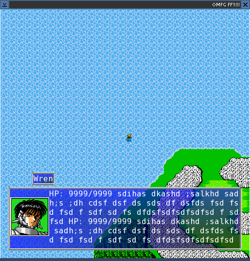
I'll be adding a little triangle to the corner that lets you know there are more pages to view. Also, the background colors are customizable in each corner, just like in FF7, and the transparency is also user selectable, so if you don't care for my colors, no big deal, easily changed.
Specifics I would like to know:
1) is the size of this box about what you would like?
2) the name box above the main box - does it look good? Should I move it?
3) Do you like this font and font size?
4) Does the border look good?
5) Should I add more space between the character picture and the text?
6) Should I add more space between the text and the box border?
And of course, I am open to any other ideas.
I am thinking I'll be adding automatic quotes around the text if it is a character talking, but haven't gotten to that yet. Also, there is no technical reason why you can't still walk around with the message box open or move it to the top of the screen, both like in Chrono Trigger, so I'll probably set that up too.
(Also if you are curious as to why it looks like Final Fantasy one underneath, it is because I stole FF1 art and the overworld map for my testing. It just gives me something to quickly look at. The picture of the character is likewise stolen from Phantasy Star IV.)
I also did a little more work to the menu; it now looks like this:
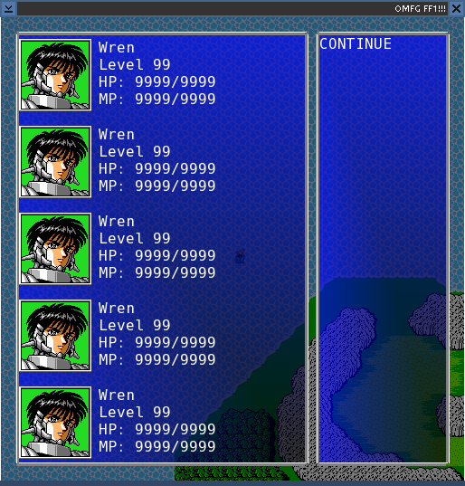
The main difference is I darkened the background so it stands out more.
I want to also create a couple other menu styles: one more like Chrono Trigger and maybe one more like Phantasy Star and Dragon Warrior. But those will be coming a ways later. All menu styles will have the same capabilities; they just look different.
Again, any comments are welcome.

I'll be adding a little triangle to the corner that lets you know there are more pages to view. Also, the background colors are customizable in each corner, just like in FF7, and the transparency is also user selectable, so if you don't care for my colors, no big deal, easily changed.
Specifics I would like to know:
1) is the size of this box about what you would like?
2) the name box above the main box - does it look good? Should I move it?
3) Do you like this font and font size?
4) Does the border look good?
5) Should I add more space between the character picture and the text?
6) Should I add more space between the text and the box border?
And of course, I am open to any other ideas.
I am thinking I'll be adding automatic quotes around the text if it is a character talking, but haven't gotten to that yet. Also, there is no technical reason why you can't still walk around with the message box open or move it to the top of the screen, both like in Chrono Trigger, so I'll probably set that up too.
(Also if you are curious as to why it looks like Final Fantasy one underneath, it is because I stole FF1 art and the overworld map for my testing. It just gives me something to quickly look at. The picture of the character is likewise stolen from Phantasy Star IV.)
I also did a little more work to the menu; it now looks like this:

The main difference is I darkened the background so it stands out more.
I want to also create a couple other menu styles: one more like Chrono Trigger and maybe one more like Phantasy Star and Dragon Warrior. But those will be coming a ways later. All menu styles will have the same capabilities; they just look different.
Again, any comments are welcome.
#207
I love the way the text boxes look sofar, as well as the menu. Man, seeing the screenshots has me excited. 
But to answer your questions...
1: Box size looks good to me.
2: The name box is acceptable, but it would be better aligned with the dialogue box's left edge and perhaps a little wider, so that the edges don't nearly touch the text inside.
3: The font is OK with me, but a serif font would probably look more appropriate.
4: Border looks simple, clean, and pleasing IMO.
5: Yes.
6: And as I said in answering 2, yes.
Last edited by Ra on Mon Jun 18, 2007 11:47 pm, edited 1 time in total.
Jonathan McKenzie
Half-Insane Snakehead | MSPaint Acolyte | Wierd TGOD'er
"Every time you stay abstinent...Kitten kills a god."
Half-Insane Snakehead | MSPaint Acolyte | Wierd TGOD'er
"Every time you stay abstinent...Kitten kills a god."
- Destructionator XV
- Lead Programmer
- Posts: 2352
- Joined: Sun Jun 12, 2005 10:12 am
- 19
- Location: Watertown, New York
- Contact:
#208
Does this look better?
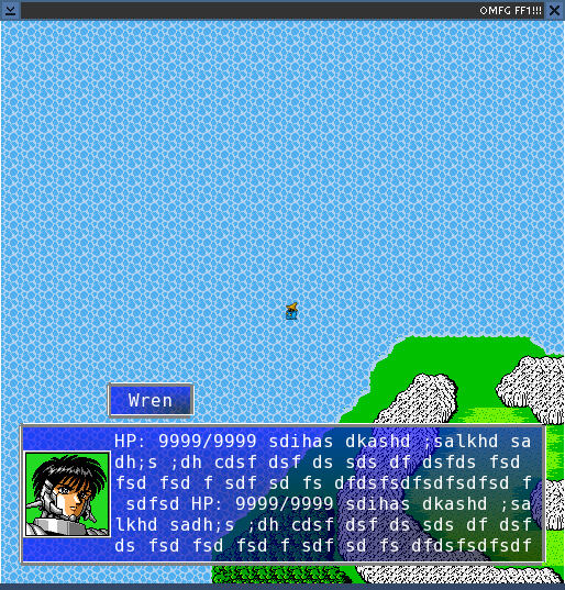
I'm looking to steal a couple other fonts off my comp now to test out, and should have screenies by the end of the day. I'll probably be able to give a choice: monospace (current), serif, and sans-serif. Also three sizes - small (size 14), medium (16), and large (20) Maybe even allow custom fonts if it all works out well.

I'm looking to steal a couple other fonts off my comp now to test out, and should have screenies by the end of the day. I'll probably be able to give a choice: monospace (current), serif, and sans-serif. Also three sizes - small (size 14), medium (16), and large (20) Maybe even allow custom fonts if it all works out well.
#209
Yes, that does look much better. Keep up the good work. 
Jonathan McKenzie
Half-Insane Snakehead | MSPaint Acolyte | Wierd TGOD'er
"Every time you stay abstinent...Kitten kills a god."
Half-Insane Snakehead | MSPaint Acolyte | Wierd TGOD'er
"Every time you stay abstinent...Kitten kills a god."
- Mayabird
- Leader of the Marching Band
- Posts: 1635
- Joined: Mon Jun 13, 2005 7:53 pm
- 19
- Location: IA > GA
- Contact:
#210
Scheme! I did that in intro CS my freshman year. It was a while back but it wasn't so hard once I figured it out, and it shouldn't be too hard to remember again.Destructionator XV wrote:Other real languages that look similar are Common Lisp and Scheme. Scheme is somewhat common in programming theory classes; that might be where.Mayabird wrote:Things are looking really good. The programming looks strangely familiar and I feel like I've used it at some point in some class, so that's a plus.
Nevertheless, I'm sure you all won't have any trouble getting the hang of it once you are able to try it out and play.
#211

This is hard to see 'cuz I got Dak to make it into a transparent PNG, but this is one of the sprites I've made for my game, a 32 x 64 sprite for the semi-finalized protagonist, named Rada. I've got this one, as well as: Facing Up, 2 walking up, 2 walking down, 2 walking left, and 2 walking right; one for each leg moving.
Here they all are, still in normal (non-transparent) PNG form:
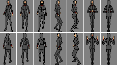
I might edit them some more, tweaking pixels here and there, but these are pretty much close to completion.
EDIT: Re-loaded the picture. It has improved proportions and two more poses for battle attack moves (I don't plan on making seperate battle sprites).
EDIT2: Two more added.
Last edited by Ra on Tue Jun 19, 2007 3:54 pm, edited 4 times in total.
Jonathan McKenzie
Half-Insane Snakehead | MSPaint Acolyte | Wierd TGOD'er
"Every time you stay abstinent...Kitten kills a god."
Half-Insane Snakehead | MSPaint Acolyte | Wierd TGOD'er
"Every time you stay abstinent...Kitten kills a god."
- Destructionator XV
- Lead Programmer
- Posts: 2352
- Joined: Sun Jun 12, 2005 10:12 am
- 19
- Location: Watertown, New York
- Contact:
#212
It looks like I am probably actually going with 16x32 pixels for the size. That is a direct scale down from what is there, so I can do it automatically, but it means less detail. 32x64 looks too big on the 512x512 screen.
#213
I thought we had decided on 32 x 64 way back a few months ago? 

 I'm most certainly not going back and redoing this.
You, Tue Sep 12, 2006 8:28 pm wrote:I like your big sprites (the small size is no longer necessary as I have decided to go with larger 32x32 pixel images (or 64x32 if you want tall characters similar to FF6 and Chrono Trigger)).
It also looks like they can be easily animated to move, which is awesome. Do you have any side or back views of them yet, or are you currently just focusing on front view art?
Last edited by Ra on Tue Jun 19, 2007 4:56 pm, edited 2 times in total.
Jonathan McKenzie
Half-Insane Snakehead | MSPaint Acolyte | Wierd TGOD'er
"Every time you stay abstinent...Kitten kills a god."
Half-Insane Snakehead | MSPaint Acolyte | Wierd TGOD'er
"Every time you stay abstinent...Kitten kills a god."
- Destructionator XV
- Lead Programmer
- Posts: 2352
- Joined: Sun Jun 12, 2005 10:12 am
- 19
- Location: Watertown, New York
- Contact:
#214
Yes, I did, but I changed my mind when I got back into serious coding this time, since the smaller tiles (and thus characters) lets you make more detailed maps.
In the middle of this picture, you can see your character. To the right is actual size, as you created it. To the left is it scaled down automatically.
http://arsdnet.net/am34.png
If that looks decent scaled down, you needn't do any work; that is completely automatic. If not, I'll try to think of a better solution that also requires you to do no work.
#215
Ah, she looks just fine scaled-down, Adam.  I am curious about something, though... what was the larger battle sprite size you were going to use?
Last edited by Ra on Tue Jun 19, 2007 11:28 pm, edited 1 time in total.
Jonathan McKenzie
Half-Insane Snakehead | MSPaint Acolyte | Wierd TGOD'er
"Every time you stay abstinent...Kitten kills a god."
Half-Insane Snakehead | MSPaint Acolyte | Wierd TGOD'er
"Every time you stay abstinent...Kitten kills a god."
- Destructionator XV
- Lead Programmer
- Posts: 2352
- Joined: Sun Jun 12, 2005 10:12 am
- 19
- Location: Watertown, New York
- Contact:
#216
I don't think I ever decided on battle sprites; if I said anything, I probably would have said it would be the same as the regular sprites.
Now, for monsters, I probably did give some rough calculations. Which would not be the same now. 128x128 still seems to be about what I would say a large square monster would be (and 256x128 for large rectangular monster, and thus 256x256 for super large monster (that is one quarter of the whole game screen!)).
Nothing is set in stone there, but that is my ballpark guesstimate.
Also, if you already drew something, don't worry; either automatic scaling or me just making it fit should be fine. In fact, automatic scaling might be the easiest way to do it for a lot of things.
Anywho, the picture of the character's face in the above shots is 80x80 (which is the portrait size I am going with, as you can see, it fits really well on the screen). That size would probably work for a monster size too.
On character battle sprites, there is flexibility. It might be the same as the map sprite, but it need not be. For the map, the character is limited to some kind of multiple of the tile size, so it makes sense for bumping into walls and such. In battle, there shouldn't be any concerns like that.
Anyway, I need to think about it more before saying anything for sure. It is late, I am sleepy and rambling. Will say something smarter in the morning.
- Destructionator XV
- Lead Programmer
- Posts: 2352
- Joined: Sun Jun 12, 2005 10:12 am
- 19
- Location: Watertown, New York
- Contact:
#217
Characters need a hot spot and size too. More on that later. First, picture time.
These are screenshots I just nabbed off a emulated Dragon Warrior III. They are to demonstrate how night time looked in that game.
Ignore the fact that I got my ass handed to me by the easiest monsters in the game, and note how the colors change.
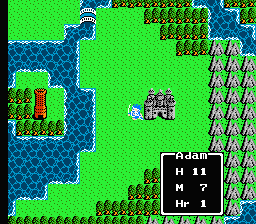
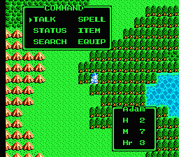
The text is green since my HP is so low. Also, since the NES could only display 16 colors at once, some other whites changed green too. I actually think that looks pretty cool, and M2 did the same thing. However, it is unlikely M3 will be able to do this. The text color can and will change, but the rest of the world will look the same.
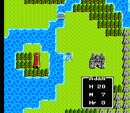
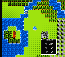
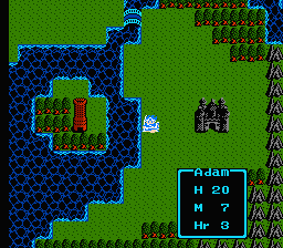
Here, you can see night time. Notice the text changing to blue, and again, due to hardware limitations, most white things also changed to blue. At this point, the fights get harder too.
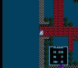
Notice how the town is also dark. Also, there are different townspeople out, and the shops are all closed at night. I'll probably add a simple night/day switch to take care of this, and you could code up more specific things if you wanted to.
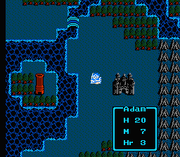
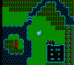
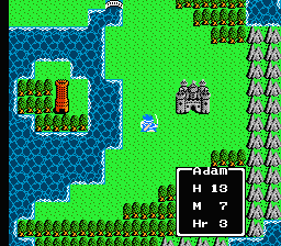
You can see the whole cycle, and you can probably observe how DW3 did it - it just used a different color palette for each individual tile for each point in the day. My M2 for DOS did exactly the same thing, and I think it worked really well.
The problem is M3 uses 32 bit color, instead of the 16 colors of the NES or 256 colors of DOS - this trick doesn't work so well anymore. (Sure, it could be simulated, but it is a lot more work, both to draw at run time and for you artists to make tiles).
I've been playing with a few alternatives. One is to take the same day picture, and shade it a certain color to make different times of day. It doesn't really look too great.
One is to have a shade color over each individual tile. You would set this in the tile editor, and the tile is merely shaded that color based on the time of day. I think this might possibly work, but I haven't actually implemented it to test it yet. More complex would be have a shade mask over it, which can be different shade colors on each pixel.
Lastly, what would of course work, but takes more effort to create, are tiles all with 6 different appearances, one for each time. You make new animations for all of them. This is also the most flexible. Perhaps offering this AND the individual shade would work.
I'm open to any other ideas. Ace - it seems we'll probably be changing that tile editor again.
These are screenshots I just nabbed off a emulated Dragon Warrior III. They are to demonstrate how night time looked in that game.
Ignore the fact that I got my ass handed to me by the easiest monsters in the game, and note how the colors change.


The text is green since my HP is so low. Also, since the NES could only display 16 colors at once, some other whites changed green too. I actually think that looks pretty cool, and M2 did the same thing. However, it is unlikely M3 will be able to do this. The text color can and will change, but the rest of the world will look the same.


Here, you can see night time. Notice the text changing to blue, and again, due to hardware limitations, most white things also changed to blue. At this point, the fights get harder too.

Notice how the town is also dark. Also, there are different townspeople out, and the shops are all closed at night. I'll probably add a simple night/day switch to take care of this, and you could code up more specific things if you wanted to.


You can see the whole cycle, and you can probably observe how DW3 did it - it just used a different color palette for each individual tile for each point in the day. My M2 for DOS did exactly the same thing, and I think it worked really well.
The problem is M3 uses 32 bit color, instead of the 16 colors of the NES or 256 colors of DOS - this trick doesn't work so well anymore. (Sure, it could be simulated, but it is a lot more work, both to draw at run time and for you artists to make tiles).
I've been playing with a few alternatives. One is to take the same day picture, and shade it a certain color to make different times of day. It doesn't really look too great.
One is to have a shade color over each individual tile. You would set this in the tile editor, and the tile is merely shaded that color based on the time of day. I think this might possibly work, but I haven't actually implemented it to test it yet. More complex would be have a shade mask over it, which can be different shade colors on each pixel.
Lastly, what would of course work, but takes more effort to create, are tiles all with 6 different appearances, one for each time. You make new animations for all of them. This is also the most flexible. Perhaps offering this AND the individual shade would work.
I'm open to any other ideas. Ace - it seems we'll probably be changing that tile editor again.
- Ace Pace
- Antisemetical Semite
- Posts: 2272
- Joined: Wed Jun 08, 2005 10:28 am
- 19
- Location: Cuddling with stress pills
- Contact:
#218
*curses*
[img=left]http://www.libriumarcana.com/Uploads/Ace/acewip7.jpg[/img]Grand Dolphin Conspiracy
The twin cub, the Cyborg dolphin wolf.
Dorsk 81: this is why I support the separation of Aces eyebrow's, something that ugly should never be joined
Mayabird:You see what this place does to us? It's like how Eskimos have their 16 names for snow. We have to precisely define what shafting we're receiving.
"Do we think Israel would be nuts enough to go back into Lebanon with Olmert still in power and calling the shots? They could hook Sharon up to a heart monitor and interpret the blips and bleeps as "yes" and "no" and do better than that, both strategically and emotionally."
The twin cub, the Cyborg dolphin wolf.
Dorsk 81: this is why I support the separation of Aces eyebrow's, something that ugly should never be joined
Mayabird:You see what this place does to us? It's like how Eskimos have their 16 names for snow. We have to precisely define what shafting we're receiving.
"Do we think Israel would be nuts enough to go back into Lebanon with Olmert still in power and calling the shots? They could hook Sharon up to a heart monitor and interpret the blips and bleeps as "yes" and "no" and do better than that, both strategically and emotionally."
- Destructionator XV
- Lead Programmer
- Posts: 2352
- Joined: Sun Jun 12, 2005 10:12 am
- 19
- Location: Watertown, New York
- Contact:
#219
Examine these two screenshots from Chrono Trigger.
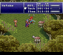
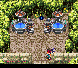
Can you see the consituant tiles? Notice how every discreet object is in multiples of half the character. In the second shot, Magus is walking directly into that wall, and cannot go past it. One step to the left, and he walks around it automatically - he moves a full tile to the left.
Open these pictures up in a paint program and zoom quite a bit in. Notice how the character sprites are all exactly 16x32 pixels, and how the actual tiles are all 16x16.
Chrono Trigger's awesome graphics are the effect of clever use of tiles and overdrawing. You can walk about one pixel at a time, but the step that counts is still in 16 pixel intervals - one tile.
Of course, the NES, Genesis and SNES screen dimensions were all about half what M3 is doing right now. I am figuring I will actually include an option where you can slash that in half (in fact, I might make that the default). Naturally, all images would be automatically scaled to still look decent on a higher resolution screen. Or I could go with the bigger sizes again. Bah.
Important thing: if you are already making artwork with 32x64, keep it. I might change my mind again (and if I don't automatic scaling down still looks fine).
- Destructionator XV
- Lead Programmer
- Posts: 2352
- Joined: Sun Jun 12, 2005 10:12 am
- 19
- Location: Watertown, New York
- Contact:
#220
More rambling.
Also, I would kinda like a way to keep the small tiles, but be able to use bigger characters and small steps. The CT way for small steps should work. But what about big characters?
The problem is every game mechanic is based upon steps on a tile. You take a step, something happens - game events happen, random battles begin, etc. The tiles also tell if you are allowed to walk on that square.
Solving the walk problem could actually be done with a fancier collision detection algorithm instead of the simple square comparison I (and all classic crpgs) do now. Not really a problem. But what about everything else?
If you are standing on two tiles at once and a fight occurs, which tile does the program use to determine the contents of that battle? If there are two sets of stairs or something right next to the other, which tile does it trigger? It can't just be both - they might be mutually exclusive options.
You might say just do whatever one collides first, from an angle or something, but what if you step on both at exactly the same time?
I can't think of a general solution that works for that. Tall or long characters are ok - just use a "hot spot" - the feet still occupy only one tile, so use them. But for wide characters where the feet can be at two places at once, it just doesn't work so well. You might think of specifying a hot spot there too, but it wouldn't coincide with the graphics, thus sucking.
I dunno. Scaling up tiles to match the character's feet or scaling down feet to match tiles are the only things I can think of that work in all situations.
edit: Don't fear thought; whatever I do, I can do the scaling entirely automatically, so it means no extra work for you. It doesn't even require the tile file format to change in any way; it is already designed to handle scaling like this.
Last edited by Destructionator XV on Thu Jun 21, 2007 2:44 pm, edited 1 time in total.
- Ace Pace
- Antisemetical Semite
- Posts: 2272
- Joined: Wed Jun 08, 2005 10:28 am
- 19
- Location: Cuddling with stress pills
- Contact:
#221
I've waited untill I've had a chance to play around mentally with some concepts before replying.
In terms of artists...not sure.
Meanwhile, I'm going to start working on a character editor format, acording to what you laid out.
That idea would be stupid, work around it with blending I suppose, full scale color shifts.Destructionator XV wrote: You can see the whole cycle, and you can probably observe how DW3 did it - it just used a different color palette for each individual tile for each point in the day. My M2 for DOS did exactly the same thing, and I think it worked really well.
The problem is M3 uses 32 bit color, instead of the 16 colors of the NES or 256 colors of DOS - this trick doesn't work so well anymore. (Sure, it could be simulated, but it is a lot more work, both to draw at run time and for you artists to make tiles).
Shade colors acording to their color range, the shading given to green isn't neccesarily the same shading given to red. But this IS complicated.I've been playing with a few alternatives. One is to take the same day picture, and shade it a certain color to make different times of day. It doesn't really look too great.
Eh, or as I said, for ranges. Per tile would be...painful, but workable. Also, harder on artists, that would require artists to try out differant blends. Ra, pitch in?One is to have a shade color over each individual tile. You would set this in the tile editor, and the tile is merely shaded that color based on the time of day. I think this might possibly work, but I haven't actually implemented it to test it yet. More complex would be have a shade mask over it, which can be different shade colors on each pixel.
Explain?Lastly, what would of course work, but takes more effort to create, are tiles all with 6 different appearances, one for each time. You make new animations for all of them. This is also the most flexible. Perhaps offering this AND the individual shade would work.
In terms of laziness, I'm pro just adding a shade color for each frame, utterly easy to implement, the hard step would be adding the visual display for shaded previews.I'm open to any other ideas. Ace - it seems we'll probably be changing that tile editor again.
In terms of artists...not sure.
Meanwhile, I'm going to start working on a character editor format, acording to what you laid out.
[img=left]http://www.libriumarcana.com/Uploads/Ace/acewip7.jpg[/img]Grand Dolphin Conspiracy
The twin cub, the Cyborg dolphin wolf.
Dorsk 81: this is why I support the separation of Aces eyebrow's, something that ugly should never be joined
Mayabird:You see what this place does to us? It's like how Eskimos have their 16 names for snow. We have to precisely define what shafting we're receiving.
"Do we think Israel would be nuts enough to go back into Lebanon with Olmert still in power and calling the shots? They could hook Sharon up to a heart monitor and interpret the blips and bleeps as "yes" and "no" and do better than that, both strategically and emotionally."
The twin cub, the Cyborg dolphin wolf.
Dorsk 81: this is why I support the separation of Aces eyebrow's, something that ugly should never be joined
Mayabird:You see what this place does to us? It's like how Eskimos have their 16 names for snow. We have to precisely define what shafting we're receiving.
"Do we think Israel would be nuts enough to go back into Lebanon with Olmert still in power and calling the shots? They could hook Sharon up to a heart monitor and interpret the blips and bleeps as "yes" and "no" and do better than that, both strategically and emotionally."
- Destructionator XV
- Lead Programmer
- Posts: 2352
- Joined: Sun Jun 12, 2005 10:12 am
- 19
- Location: Watertown, New York
- Contact:
#222
It is a real pity I can't have my palette swaps anymore. You could do so many cool things with it, all without needing to touch the actual framebuffer. Storing palette swaps of images took so little memory, and took so little time to create artistically (which is why you see them so often in practically every game pre-3d). Doing one at runtime was almost instant - a mere 4 instructions and a handful of bytes down the wire to the graphics hardware - blazingly fast, even on a 386.Ace Pace wrote:That idea would be stupid, work around it with blending I suppose, full scale color shifts.
It was awesome.
One idea would be take the color, convert it to its approximate wavelength, and from there guesstimate an absorbtion spectrum from it, then use that to guesstimate what it would look like under different light.Shade colors acording to their color range, the shading given to green isn't neccesarily the same shading given to red. But this IS complicated.
Of course, that is going to take much fancier code for me to implement (probably have to dive into some unholy black magic like pixels shaders since I don't have a palette to easily work with), and still probably won't be accurate.
Or I could just guesstimate it with a table of pre-made estimates. That actually sounds decent.
It also lacks flexibility - what about a town with artificial lights at night?
Yes, it would, but that could be trivialized with a color slider in a program. You just slide it until it looks right, then hit OK.Eh, or as I said, for ranges. Per tile would be...painful, but workable. Also, harder on artists, that would require artists to try out differant blends.
Every tile actually has 6 complete animation sequences instead of one. One for each time of day. (I broke it up into 6 in M2 and it looked fine, so I want to do that again).Explain?
Offering this as an option gives infinite flexibility in the graphics, at the expense of more work. So if I also offer a default shade option that works if you leave a time blank, it saves work.
Also on night - you need to be able to test for it when going in a cave, so you can offer entirely different cave layouts based on time of day. That is unrelated to this though; it is just a scripted if.
Yeah, it is by far the easiest to implement, since it can be 'dumb drawn' over it; just drawing a semi transparent box instead of anything fancier. It doesn't look as good as a real palette swap, but I think it might be a happy compromise.In terms of laziness, I'm pro just adding a shade color for each frame, utterly easy to implement, the hard step would be adding the visual display for shaded previews.
Again, a simple slider in the editor (with sane defaults) can take most the burden off the artists. It is pretty easy all around.
- Ace Pace
- Antisemetical Semite
- Posts: 2272
- Joined: Wed Jun 08, 2005 10:28 am
- 19
- Location: Cuddling with stress pills
- Contact:
#223
Should work, though splitting up 6...Okay. Not sure I fully understand.
Never underestimate estimates, they usually end up looking better then 2 weeks work on the pixel shader.
Or I could just guesstimate it with a table of pre-made estimates. That actually sounds decent.
[img=left]http://www.libriumarcana.com/Uploads/Ace/acewip7.jpg[/img]Grand Dolphin Conspiracy
The twin cub, the Cyborg dolphin wolf.
Dorsk 81: this is why I support the separation of Aces eyebrow's, something that ugly should never be joined
Mayabird:You see what this place does to us? It's like how Eskimos have their 16 names for snow. We have to precisely define what shafting we're receiving.
"Do we think Israel would be nuts enough to go back into Lebanon with Olmert still in power and calling the shots? They could hook Sharon up to a heart monitor and interpret the blips and bleeps as "yes" and "no" and do better than that, both strategically and emotionally."
The twin cub, the Cyborg dolphin wolf.
Dorsk 81: this is why I support the separation of Aces eyebrow's, something that ugly should never be joined
Mayabird:You see what this place does to us? It's like how Eskimos have their 16 names for snow. We have to precisely define what shafting we're receiving.
"Do we think Israel would be nuts enough to go back into Lebanon with Olmert still in power and calling the shots? They could hook Sharon up to a heart monitor and interpret the blips and bleeps as "yes" and "no" and do better than that, both strategically and emotionally."
- Destructionator XV
- Lead Programmer
- Posts: 2352
- Joined: Sun Jun 12, 2005 10:12 am
- 19
- Location: Watertown, New York
- Contact:
#224
6 is just six times of day: 3 day, 3 night.
Look at the DW3 screenies above. It had 7 times of day - 4 day and 3 night. I might go with that too.
Look at the DW3 screenies above. It had 7 times of day - 4 day and 3 night. I might go with that too.
- Destructionator XV
- Lead Programmer
- Posts: 2352
- Joined: Sun Jun 12, 2005 10:12 am
- 19
- Location: Watertown, New York
- Contact:
#225
I think I like it better with 32x32 pixel tiles...
here are some screenies.
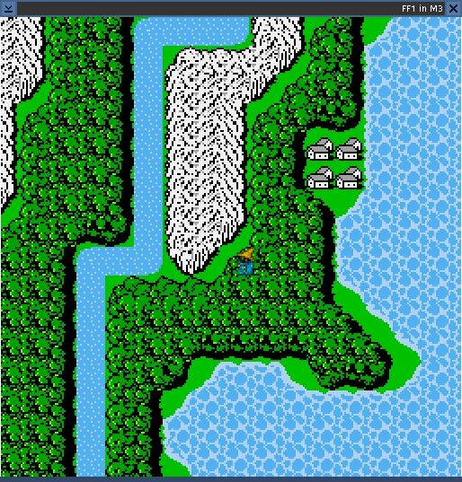
You can see it looks more like the actual consoles (if you take those CT screenies and blow them up to 2x zoom, it would look pretty much just like this). Of course, the resolution here is actually 2x higher, so there could potentially be much more detail in an actual M3 tile.
Of course, you see less of the map at once like this, but that has advantages, since you can get away with making smaller maps.
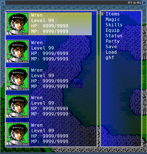
The tiles have gotten bigger, but notice that has no effect on everything else. The text remains the same, etc.
The image of the character that you see under the menu looks weird because my software scaling algorithm is buggy. (The hardware scaling looks fine though, which is the one you see in the first shot. I'll fix the software one before the real release.)
I am also implementing the per pixel walking like I explained from the Chrono Trigger screenshot. That is actually really easy to do, and lets you move in smoother steps, even with big tiles.
If you hate the bigger look, it is easy to change; it is all based on a single constant in the code. I could potentially even make that a variable and let you pick your own, but I'm a little meh on that.
Note that you can make tiles (and characters) in any size, and it does all the resizing for you. These are actual FF1 tiles - still 16x16, just scaled up automatically.
here are some screenies.

You can see it looks more like the actual consoles (if you take those CT screenies and blow them up to 2x zoom, it would look pretty much just like this). Of course, the resolution here is actually 2x higher, so there could potentially be much more detail in an actual M3 tile.
Of course, you see less of the map at once like this, but that has advantages, since you can get away with making smaller maps.

The tiles have gotten bigger, but notice that has no effect on everything else. The text remains the same, etc.
The image of the character that you see under the menu looks weird because my software scaling algorithm is buggy. (The hardware scaling looks fine though, which is the one you see in the first shot. I'll fix the software one before the real release.)
I am also implementing the per pixel walking like I explained from the Chrono Trigger screenshot. That is actually really easy to do, and lets you move in smoother steps, even with big tiles.
If you hate the bigger look, it is easy to change; it is all based on a single constant in the code. I could potentially even make that a variable and let you pick your own, but I'm a little meh on that.
Note that you can make tiles (and characters) in any size, and it does all the resizing for you. These are actual FF1 tiles - still 16x16, just scaled up automatically.
Last edited by Destructionator XV on Fri Jun 22, 2007 1:07 pm, edited 1 time in total.